
Between Google’s Mobile First Index ranking mobile-friendly websites higher than their desktop counterpoints and 36% of 2016’s Black Friday/Cyber Monday purchases coming from mobile devices, it’d be an understatement to say 2017 will be big for mobile. We’re all spending more and more time browsing Facebook, Instagram, Reddit, news sites, and just the internet in general on our smartphones.
But how much traffic will there really be from mobile devices? According to a report from Klick Wire, nearly three-quarters of it. 74% of all internet traffic in the United States will come from mobile devices in 2017 (that should grow to well over 80% by 2018). Worldwide, we’re looking at 75% on average.
What does that mean for you and your site? Are Google’s crawler bots seeing your site? Is your site from Seven Ages Design mobile-friendly or responsive? And what’s the difference?
We’ll answer the most important question first: Yes, your Seven Ages Design website is responsive. Google’s bots are responding to your site exactly as they should. Seven Ages Design has made sure its websites have been responsive since we started. To us, it’s an expected design feature, like seat-belts in a car. It’d be more alarming to buy a new car without seat-belts than one with them, right? Having a responsive site has become as essential as a seatbelt.
So what is a responsive site? A responsive site automatically adjusts its display based off the size of the screen that’s viewing it. If one of your customers views your site from their iPhone 6S, the site will optimize itself to be viewed on that screen. It’ll readjust if a customer transitions to an iPad or tablet, laptop or giant monitor. The best part of a responsive site? You don’t have to do a thing. Since the responsive capabilities are built-in, the hard work of formatting for each different size screen is done immediately on the backend.
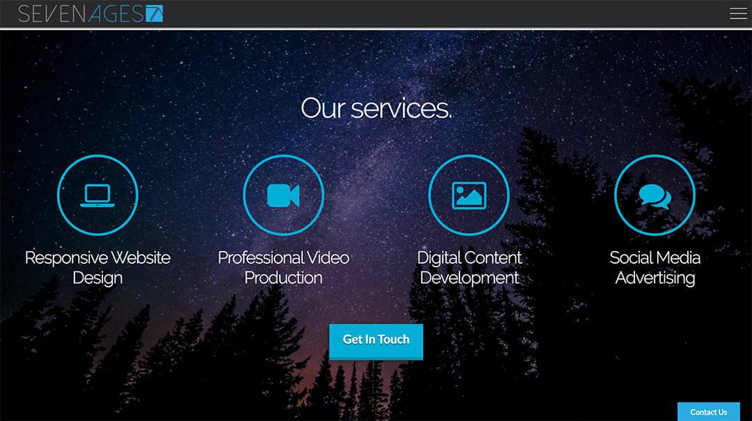
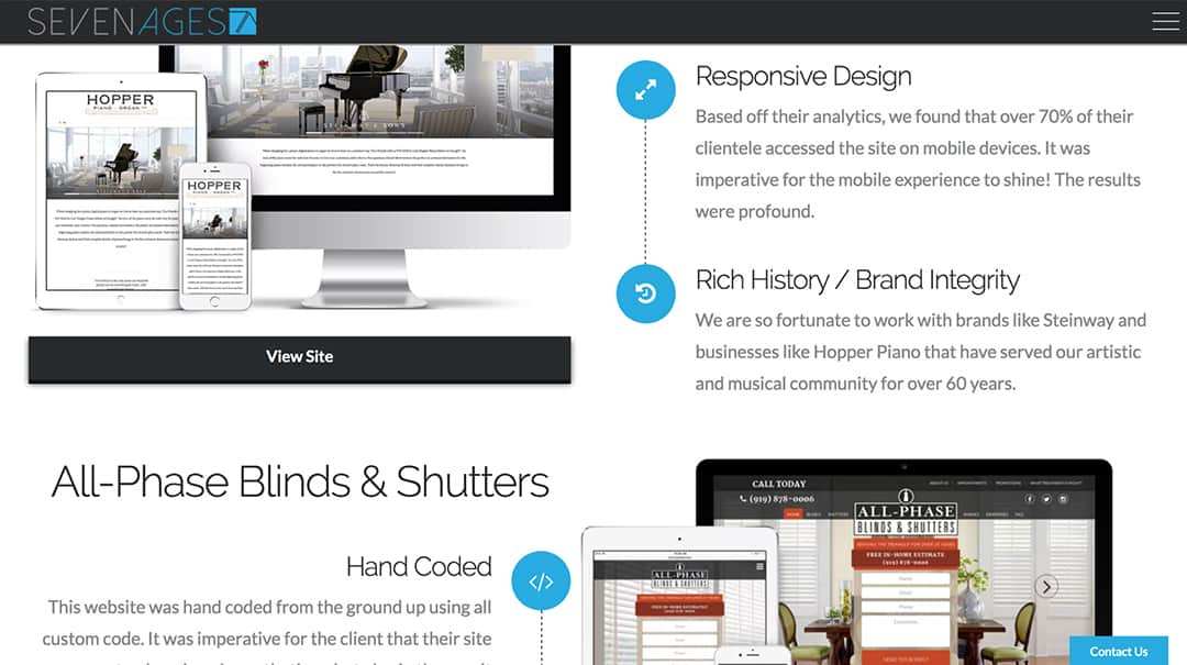
But take a look for yourself; here are a couple screenshots of the Seven Ages Design home page:
And here are those same areas of the page on mobile:
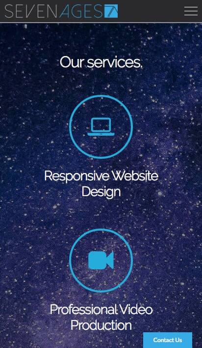
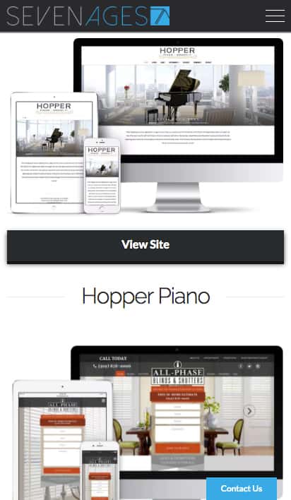
See how the responsive design rearranges text, icons, graphics, images, and video? All without you, me, or your customer having to think about a thing. In fact, you can test this yourself: head to the Seven Ages Design site, scroll a bit, and then make the window really skinny. Scroll around some more — that’s responsive design in action.
How is a responsive site different than a mobile site? Which is better? A mobile site is a separate site than your desktop/laptop site — it has a different web address (usually looks like https://m.domain.com or https://mobile.domain.com). Which means twice the files, twice the maintenance, twice the upkeep. If you were to update your desktop site, the mobile site wouldn’t update and vice versa.
That’s why we prefer the responsive site. The website we’ll build for you will look great regardless of the screen it’s on. Your customer could be browsing on anything from an old iPhone 3G to a brand new iPad Air, from a 43″ Dell 4K monitor to a laptop. With a responsive site, your site’s content adjusts itself for the best viewing experience on each device. Your customers aren’t tied to just one device and neither is your site.
Between Google’s Mobile First Index ranking mobile-friendly websites higher than their desktop counterpoints and 36% of 2016’s Black Friday/Cyber Monday purchases coming from mobile devices, it’d be an understatement to say 2017 will be big for mobile. We’re all spending more and more time browsing Facebook, Instagram, Reddit, news sites, and just the internet in general on our smartphones.
But how much traffic will there really be from mobile devices? According to a report from Klick Wire, nearly three-quarters of it. 74% of all internet traffic in the United States will come from mobile devices in 2017 (that should grow to well over 80% by 2018). Worldwide, we’re looking at 75% on average.
What does that mean for you and your site? Are Google’s crawler bots seeing your site? Is your site from Seven Ages Design mobile-friendly or responsive? And what’s the difference?
We’ll answer the most important question first: Yes, your Seven Ages Design website is responsive. Google’s bots are responding to your site exactly as they should. Seven Ages Design has made sure its websites have been responsive since we started. To us, it’s an expected design feature, like seat-belts in a car. It’d be more alarming to buy a new car without seat-belts than one with them, right? Having a responsive site has become as essential as a seatbelt.
So what is a responsive site? A responsive site automatically adjusts its display based off the size of the screen that’s viewing it. If one of your customers views your site from their iPhone 6S, the site will optimize itself to be viewed on that screen. It’ll readjust if a customer transitions to an iPad or tablet, laptop or giant monitor. The best part of a responsive site? You don’t have to do a thing. Since the responsive capabilities are built-in, the hard work of formatting for each different size screen is done immediately on the backend.
But take a look for yourself; here are a couple screenshots of the Seven Ages Design home page:
And here are those same areas of the page on mobile:
See how the responsive design rearranges text, icons, graphics, images, and video? All without you, me, or your customer having to think about a thing. In fact, you can test this yourself: head to the Seven Ages Design site, scroll a bit, and then make the window really skinny. Scroll around some more — that’s responsive design in action.
How is a responsive site different than a mobile site? Which is better? A mobile site is a separate site than your desktop/laptop site — it has a different web address (usually looks like https://m.domain.com or https://mobile.domain.com). Which means twice the files, twice the maintenance, twice the upkeep. If you were to update your desktop site, the mobile site wouldn’t update and vice versa.
That’s why we prefer the responsive site. The website we’ll build for you will look great regardless of the screen it’s on. Your customer could be browsing on anything from an old iPhone 3G to a brand new iPad Air, from a 43″ Dell 4K monitor to a laptop. With a responsive site, your site’s content adjusts itself for the best viewing experience on each device. Your customers aren’t tied to just one device and neither is your site.